This year has brought us bold new challenges and unique perspectives! Our Brightscout team grew fast and thoughtfully, incorporating offices in Serbia, India, Argentina, and the United States. Moreover, we've implemented several new internal processes to support this growth and help us run like a well-oiled machine.
Along with these new changes, we realized that our goals and mission became more ambitious: we wanted to be the agency that “transforms the world’s most innovative companies into the best versions of themselves”. To make that happen, we needed a new brand to go along with this new mindset.
But this new look is more than a pretty design, it's a new way of conceiving our strategy, design, and technology services for our clients. It represents an agency with a premium, polished and innovative appearance. It illustrates how we care about consistently delivering ideas and work that matters and exceeds client expectations—representing how we care about our projects and what we do.
Brightscout drinks its own Kool-Aid
We spruced up the branding for our second favorite client (ourselves).
Wait, don’t move a pixel
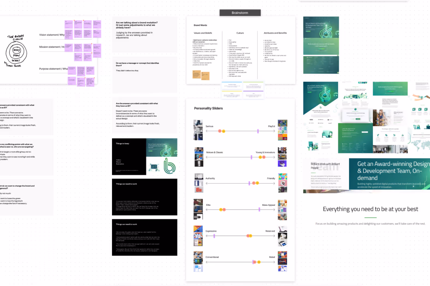
Before we could tweak a single pixel, we needed to comprehensively understand where we stood and where we wanted to go with our identity.
The rebrand provided us with a unique opportunity to test our own process on ourselves. We think the outcomes look Muy Caliente 🌶️ if we may so ourselves.
.avif)
Action time!
We like to start our brand identity projects one way and one way only: reading and research. Followed by more reading and more research. All new insights gathered during this process usually end up within a big FigJam mess of post-its and notes. Creating beautiful chaos that leads to visual magic.
Let’s get the mood just right
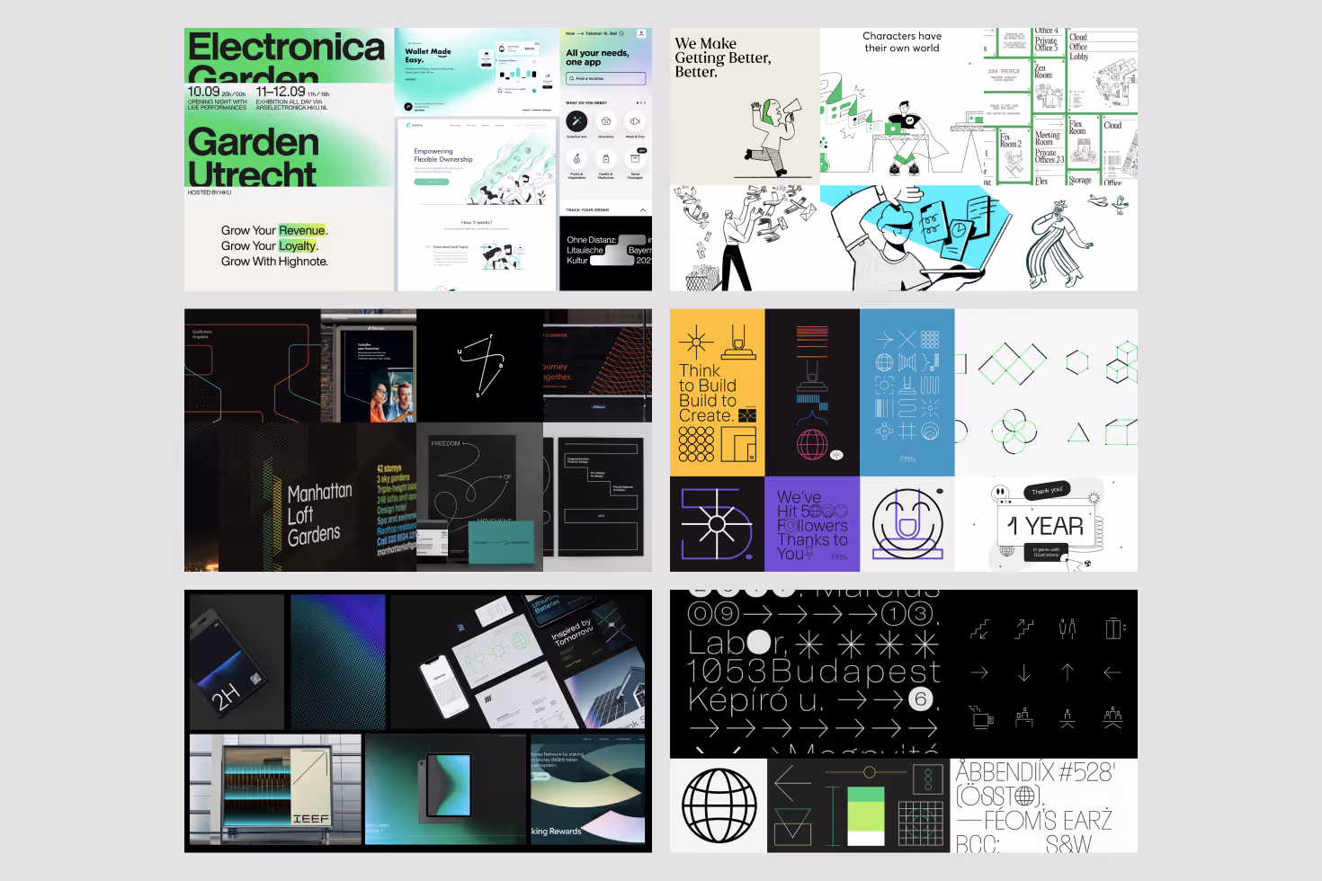
It may sound a little nerdy, but we ❤️ moodboards. It's a great way to visualize ideas without having to design a thing.
Once we have a clear visual idea, we begin one of our favorite hacks, the style scape. In fact, for our rebrand, we went through eight different style scape rounds before saying, “Okay, this is the way to go”.
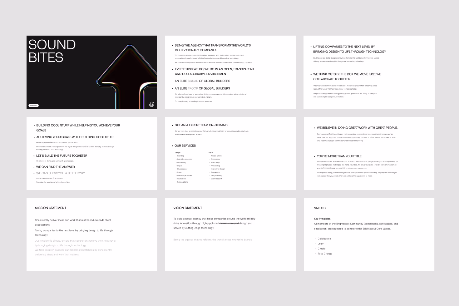
A living library of sound bites
This year’s hottest gift? The Brightscout library of sound bites. Imagine having your own library all to yourself, but it's all about us and how awesome we are. We use this library of sound bites daily as a personal arsenal of words to inspire innovation and domination.
A path well traveled
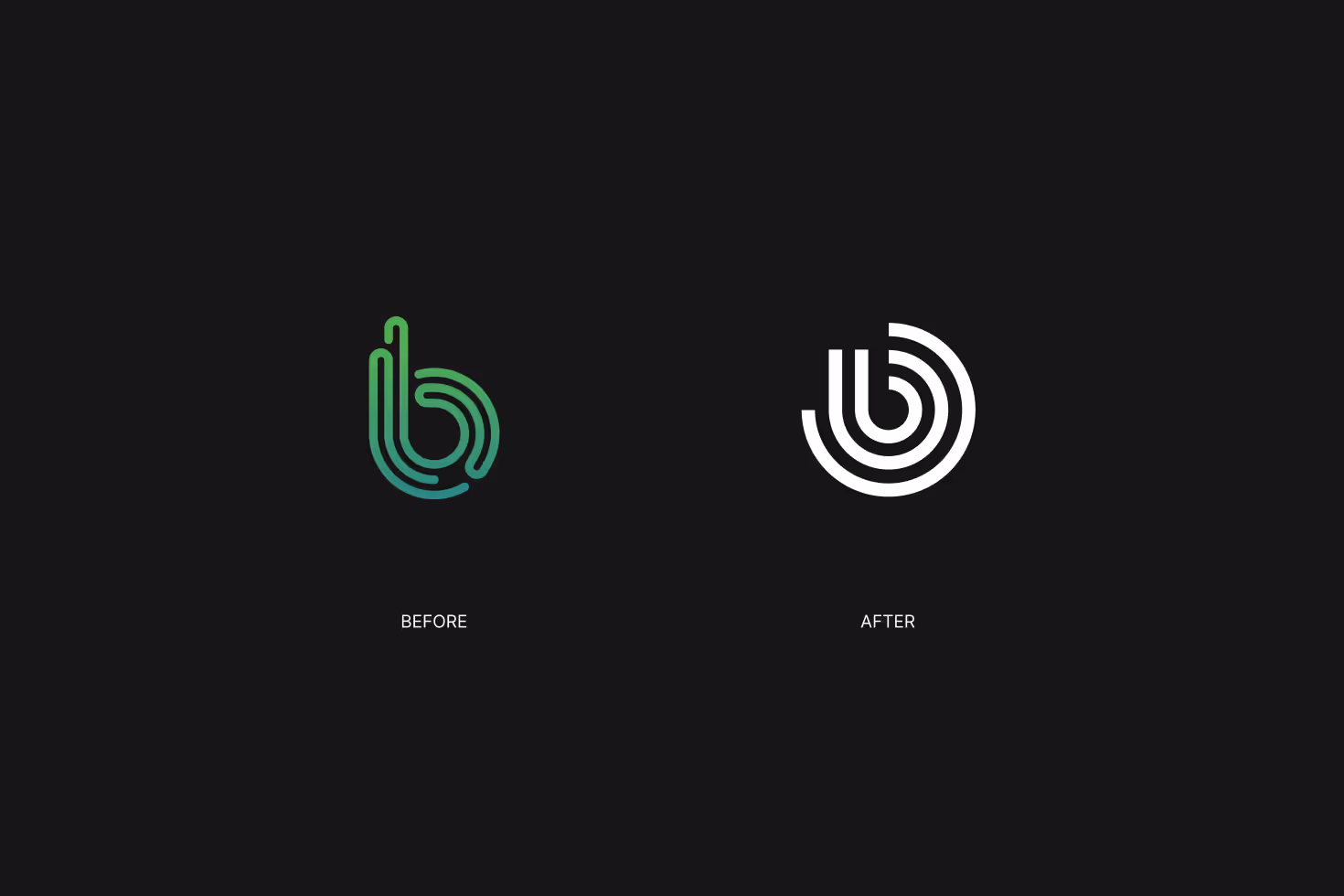
Our new logo
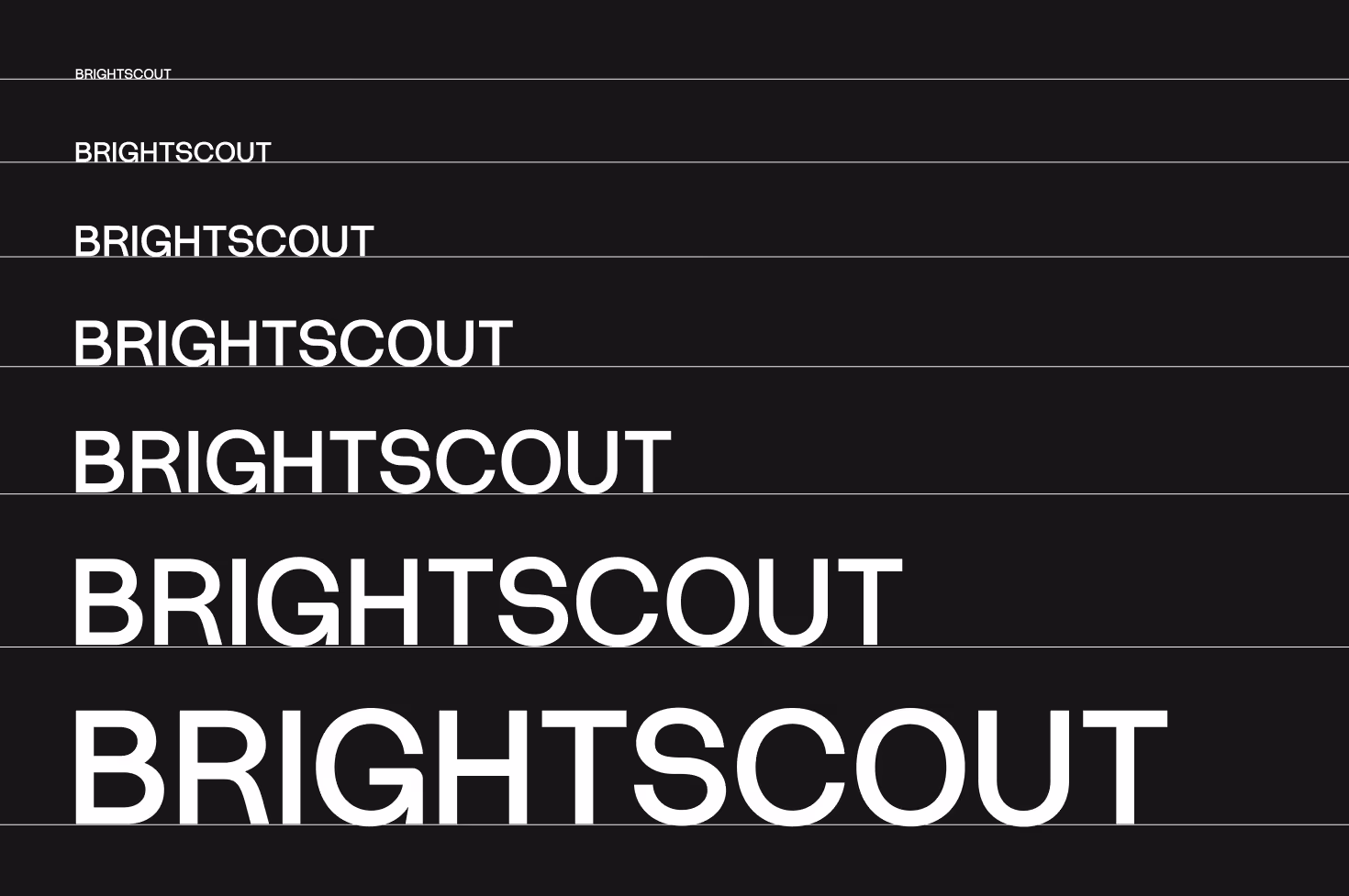
Our logotype is full-on UPPERCASE because it’s (like us) bold and on the lookout. It feels strong and sturdy. Someone you can rely on. Some might even say tall and good-looking.
The mark itself is a cleaner and more efficient version of our previous shape. It represents the winding path companies take in their journey to serve their customers and our scout's expertise to guide them along this path.
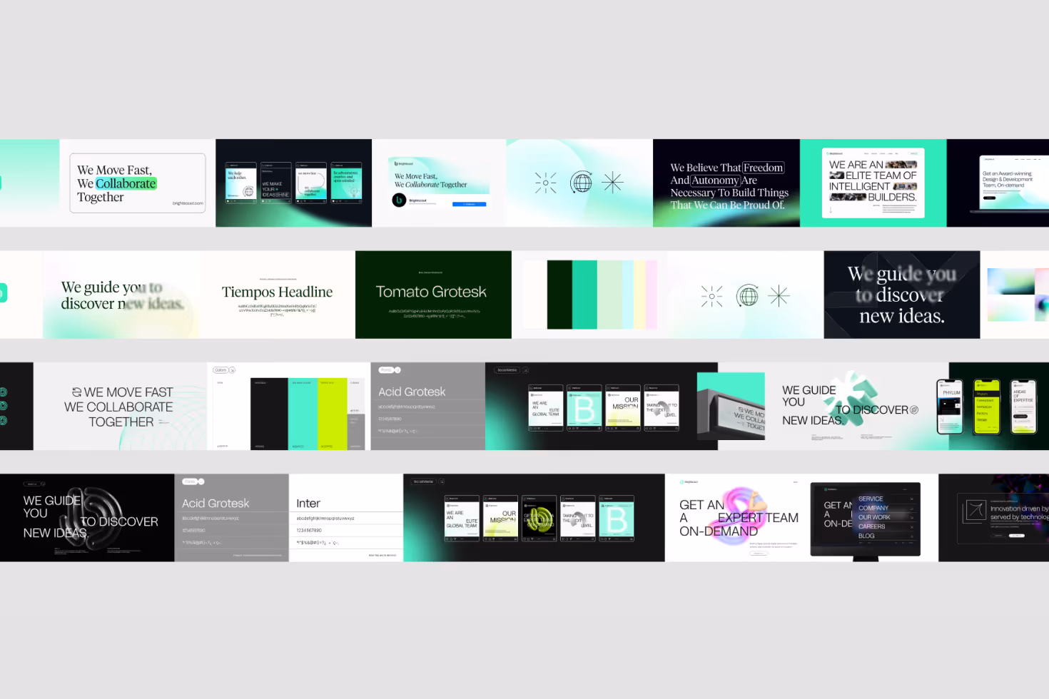
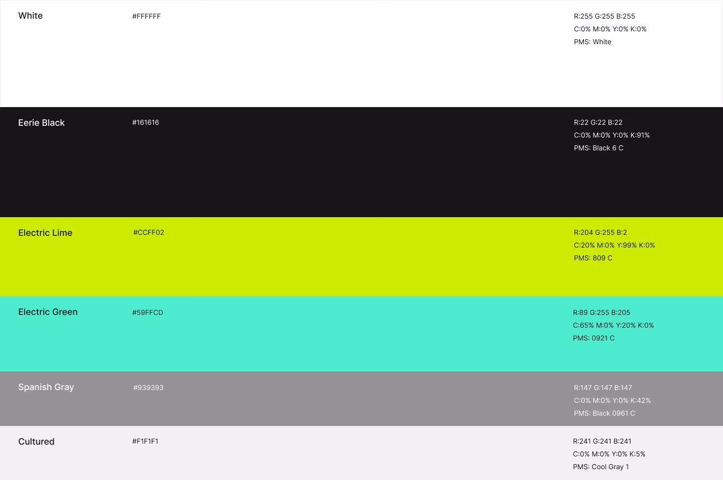
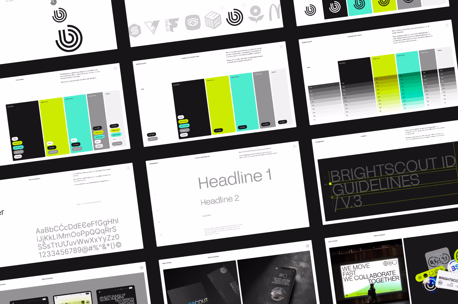
We come in colors
Our pretty palette
The Brightscout color palette is bright and easy to use. It’s like traveling through space in a psychedelic ’80s movie about time travel, and you got a little too close to the sun.
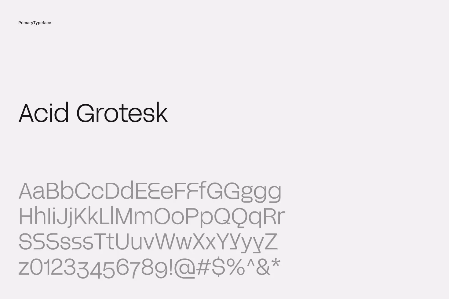
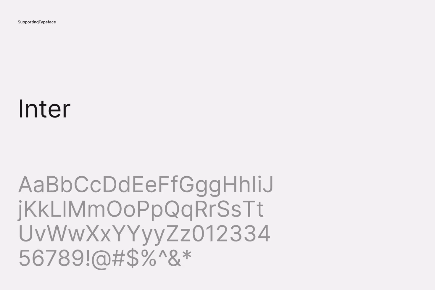
Acid + Inter
A beautiful typography combo or a casual day of microdosing
Thin, simple, subtle. But enough about our Head of Design, let’s talk about our typefaces. The chosen typefaces look like a super clean sans serif and met a stylish grotesque font. And they made the most adorable couple ever. And. Everyone. Was. Jealous.
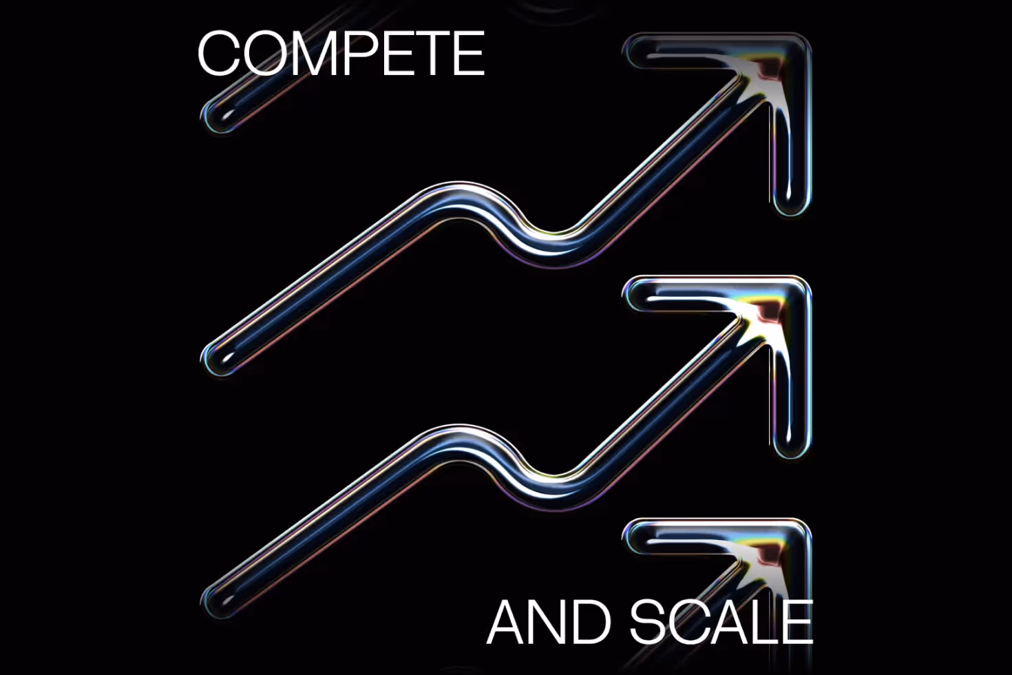
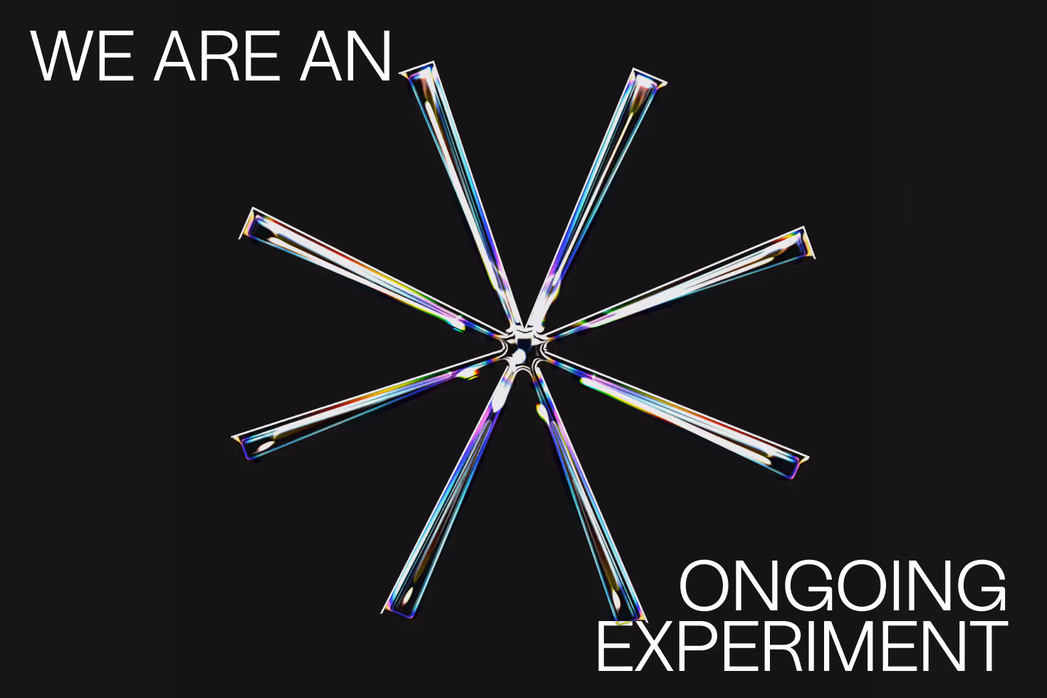
Just keep moving
Fun with 3D
You like to watch? You came to the right place.
.avif)
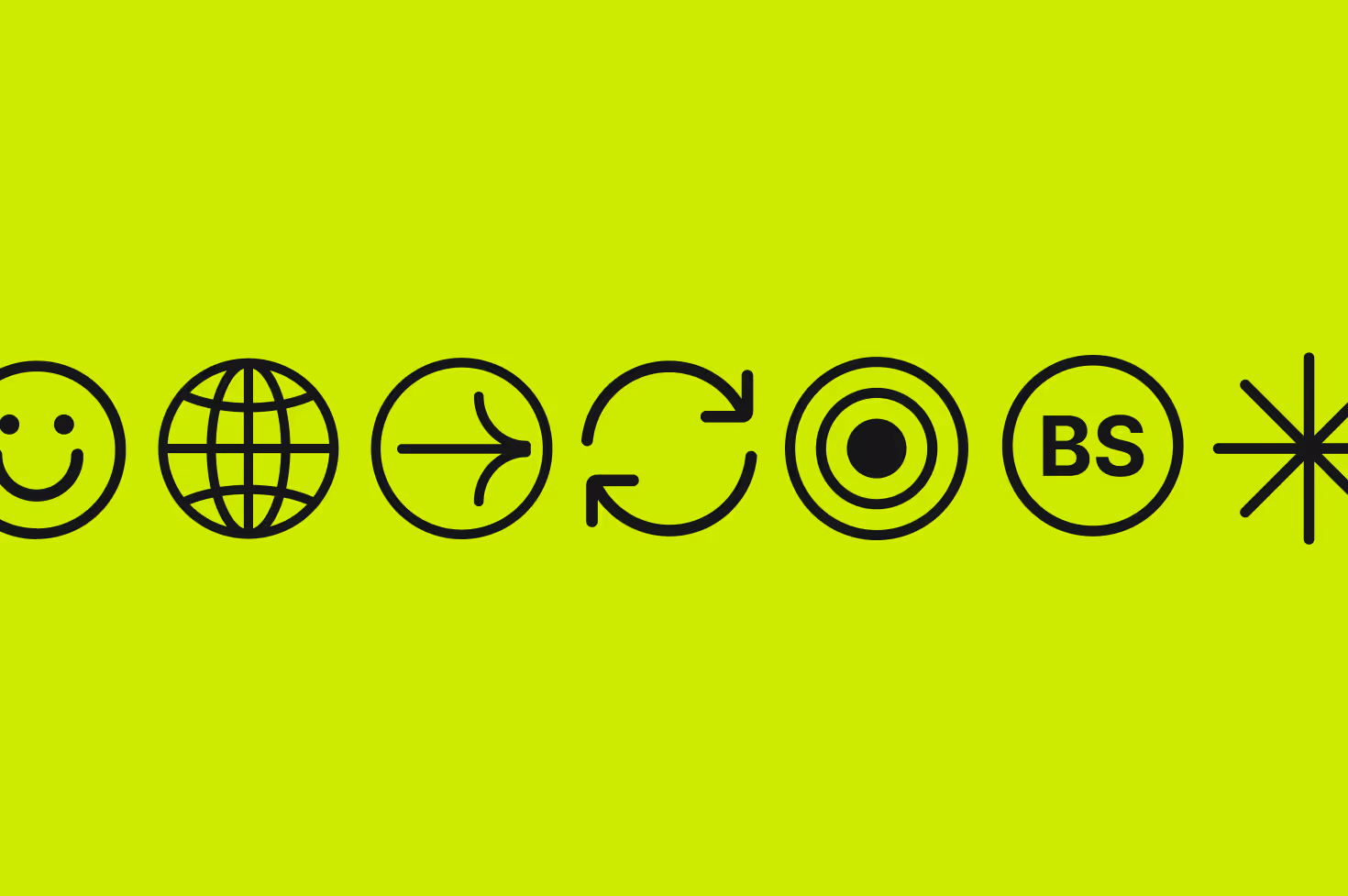
Iconic
We try to be
We designed some cool icons. Check them out. Trust us, they’re good.
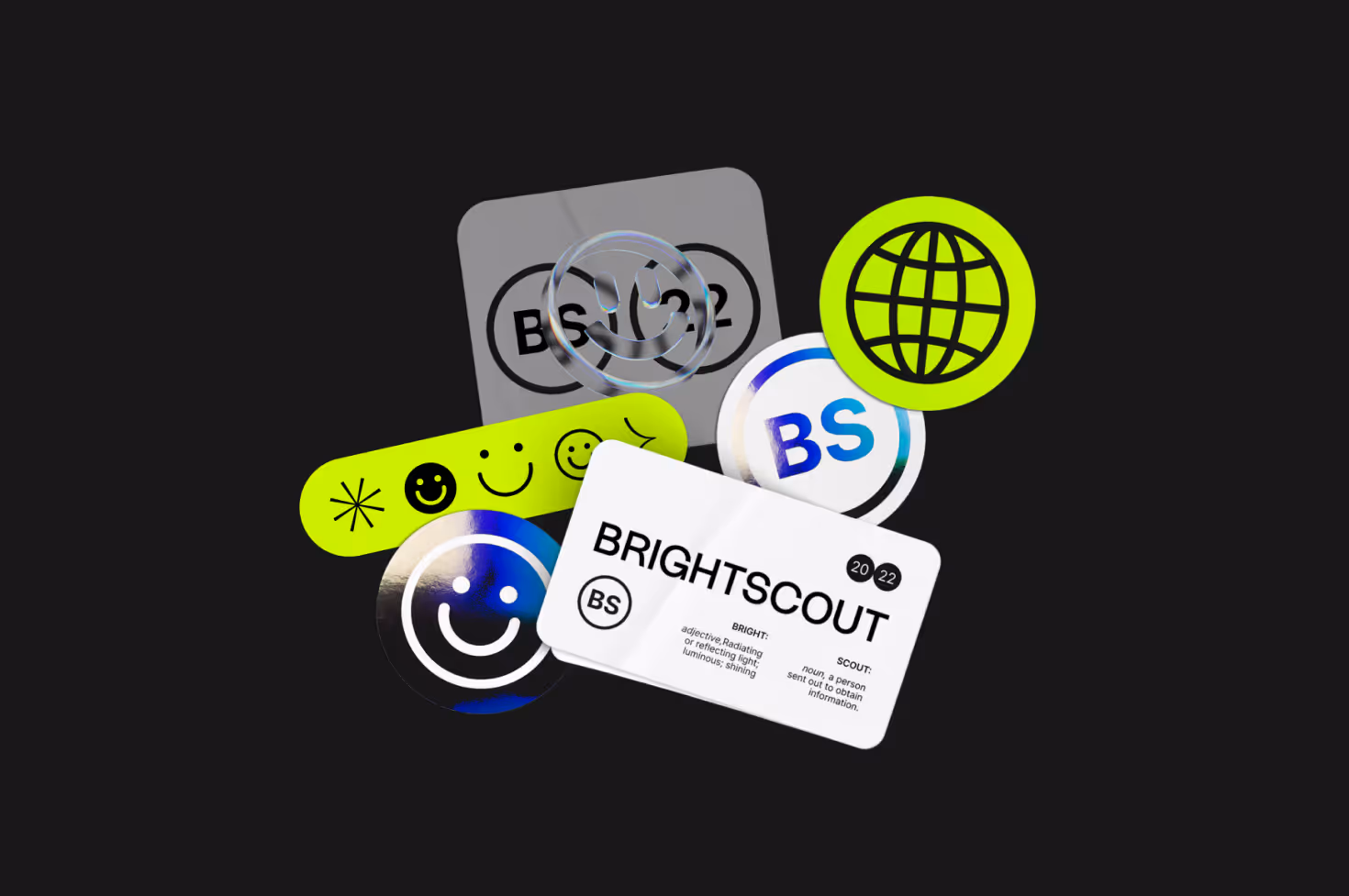
These are a few of our favorite things
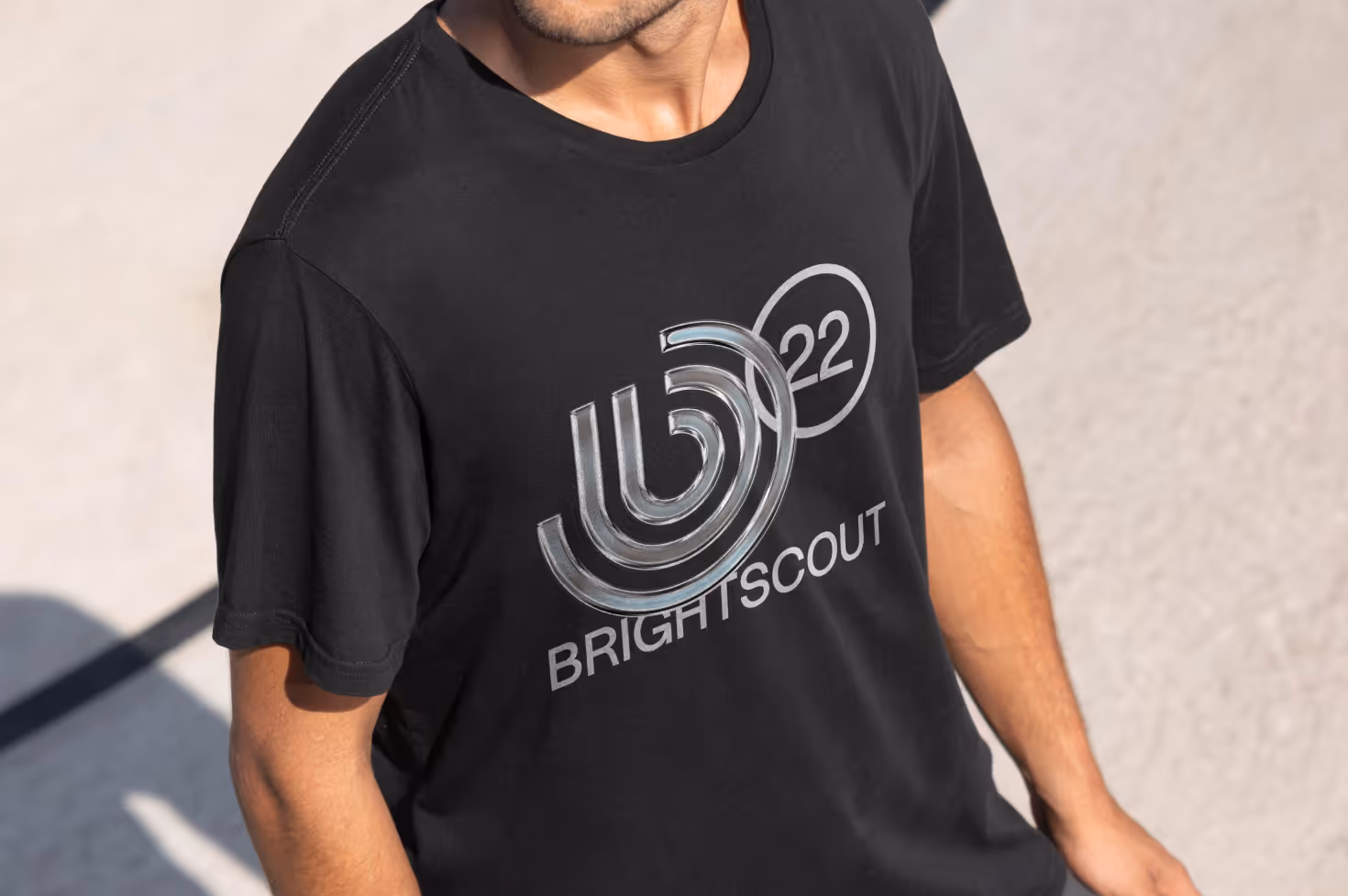
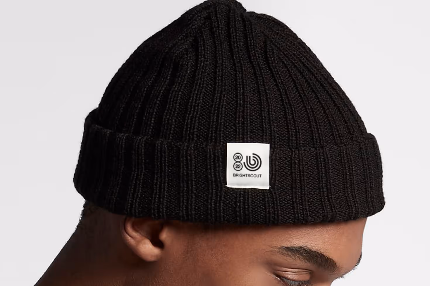
Swag for people with a little swagger
Digital is cool, but sometimes you just want to reach out and touch something. Or somebody. Or touch somebody touching something.
Beautiful Chaos
Behind the scenes
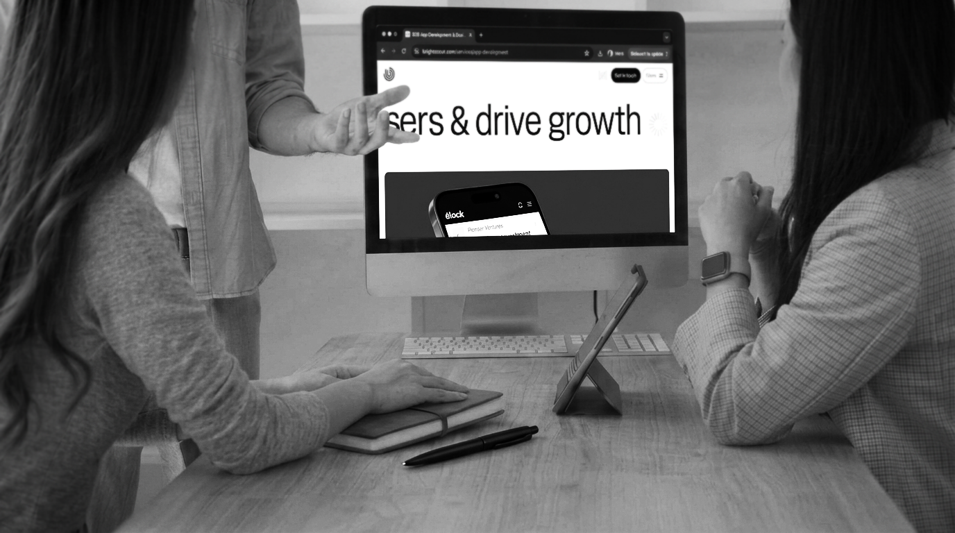
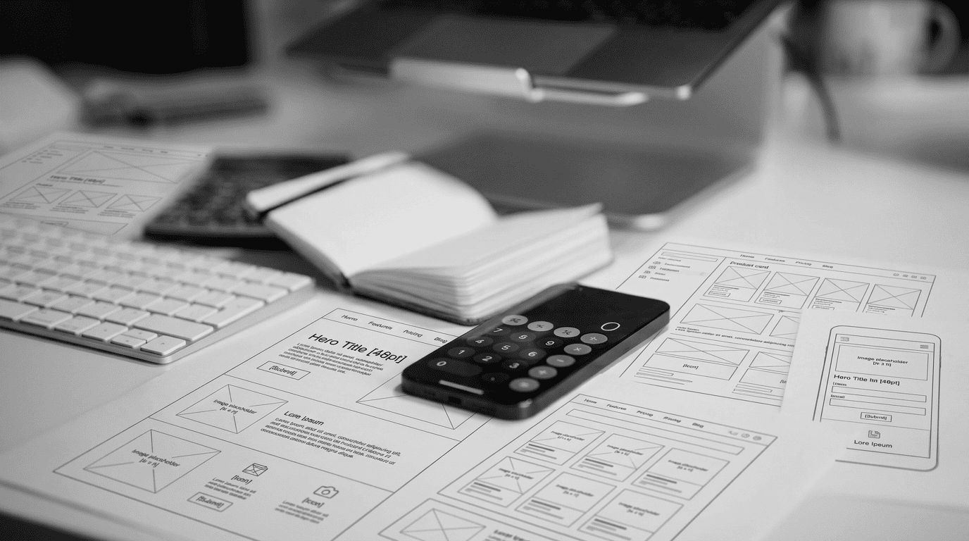
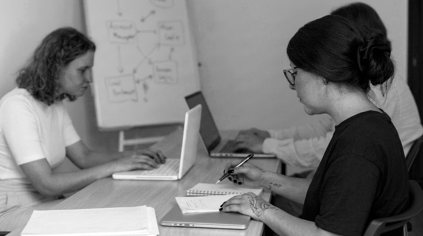
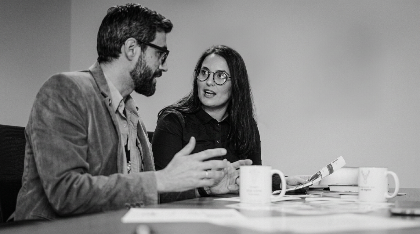
We had so much fun when we were working on the brand, you wouldn’t believe it. It was like all those people in stock photography who point at things, laughing and smiling. Except it was all real, and no one was faking it. Honestly.
Staying, in sync
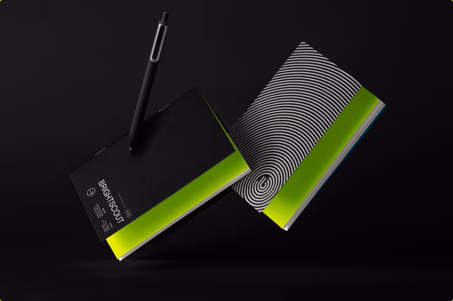
We made ourselves a book
Our style guide. It’s what keeps us all in sync. But not in sync like a boy band, hitting some sweet dance moves, all in line. No, more like a motley crew of designers, innovators and thinkers building something unique and special together as one. Yeah, like that!
If you want to expand your brand to new horizons, we invite you to explore new journeys with us. Don't hesitate! Contact us now and let's collaborate together in creating amazing things together.