

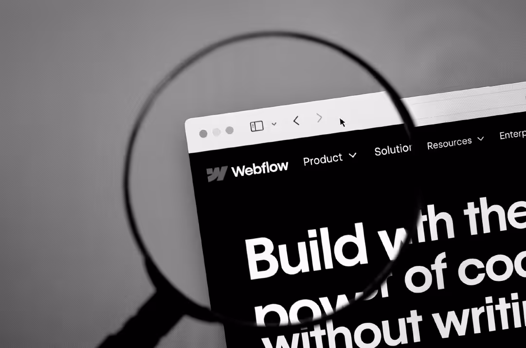
Your company website is the primary touchpoint of your brand. As your digital home, it’s the place where you’re in complete control of the experience you provide to visitors using written and visual storytelling. Since your website plays an essential role in your marketing strategy, it’s critical that you choose a platform built to handle the needs of a B2B business. More than clean code, the right platform should support scalability and offer flexible functionality that meets the unique needs of your business. That’s why Webflow is quickly becoming the top choice for building powerful and responsive B2B tech websites.
Webflow is a low-code, visual website builder and building platform that enables users to have complete control over key website elements. Its intuitive, powerful interface allows users to design beautiful, effective websites that can be published directly to Webflow using its built-in CMS and hosting service, or the code can be exported and hosted on the platform of your choice.
We've rounded up 21 of the best B2B websites built on Webflow. Each one showcases how Webflow’s capabilities enhance their own design excellence and conversion goals. Use this guide to explore your options and find inspiration that aligns with your goals.
What Makes a Great B2B Website?
A powerful B2B website combines clear positioning, conversion optimization, and lets the brand personality take center stage. It communicates what you do and why it matters. It accomplishes the task of building trust with your target audience with authoritative content and elements that support a smooth user experience. The strongest B2B websites are instantly recognizable and connected to meaningful business outcomes thanks to the following components:
- Clear value proposition. Visitors should be able to understand what you do and why it matters in under five seconds. Skip the jargon and the fluff, and state plainly what makes you stand out.
- Conversion focus. Every page should guide users toward a specific action. Whether that's booking a demo, starting a trial, or downloading a resource. Great websites are built for results, not just aesthetics.
- Trust signals. Enterprise buyers need proof. Customer logos, case studies, security certifications, and testimonials build credibility fast.
- Performance and mobile optimization. Most web traffic happens via mobile devices. Your site needs to look perfect on every viewport, and the load time must be fast.
The following companies combine smart messaging and design with Webflow’s powerful platform to nail their web presence.
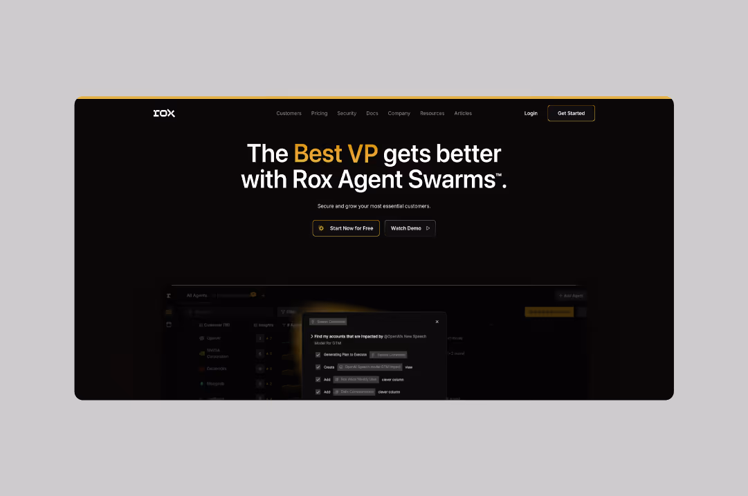
Rox
Rox uses bold, high-contrast design to communicate cutting-edge AI capabilities. The dark background makes their product demos pop, while clean typography keeps complex concepts digestible. Their homepage immediately demonstrates the power of AI agents through interactive elements that feel more like a product experience than a marketing site.
Website: rox.com
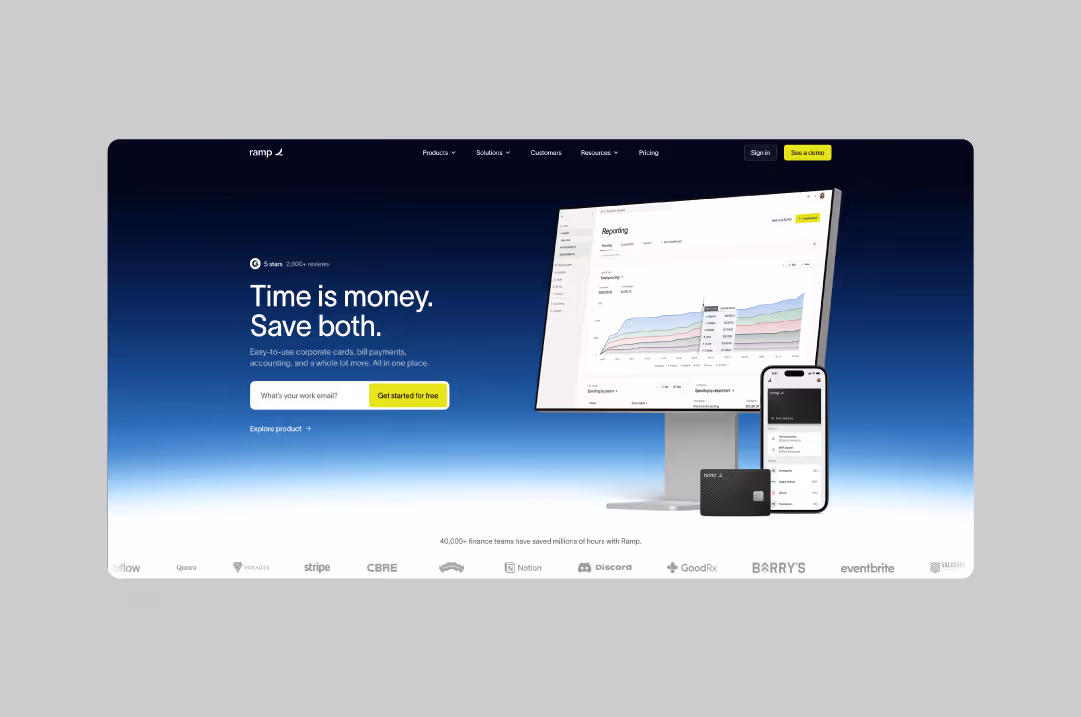
Ramp
Ramp's website screams efficiency, just like their product. Clean lines, strategic white space, and conversion-focused design guide visitors seamlessly from problem to solution. Their use of real product screenshots builds trust with enterprise buyers who need to see the platform in action. Every section drives toward demo requests.
Website: ramp.com
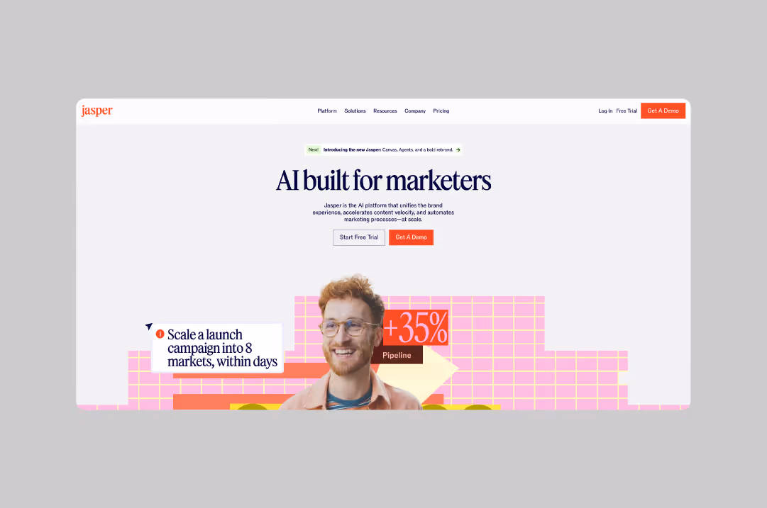
Jasper
Dynamic sections that adapt based on user behavior keep visitors engaged. Jasper balances playful AI imagery with serious business messaging. Their homepage clearly explains complex AI capabilities without overwhelming non-technical buyers. Smart use of social proof throughout builds confidence in their AI content platform.
Website: jasper.ai
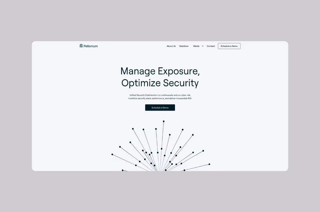
Pellonium
In cybersecurity, trust is everything. Pellonium's minimalist design contains subtle visual elements that communicate reliability and expertise. They avoid flashy graphics that might undermine credibility in favor of clean, professional presentation. The design allows the content to take center stage.
Website: pellonium.com
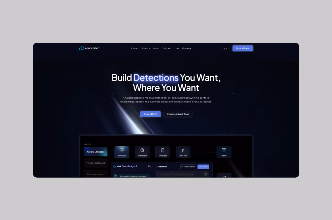
Anvilogic
Complex security concepts become clear through smart diagram-led explanations. Anvilogic uses visual storytelling to walk prospects through their platform's benefits. Technical buyers appreciate the detailed product walkthroughs without feeling overwhelmed. Their SOC automation platform feels approachable and powerful.
Website: anvilogic.com
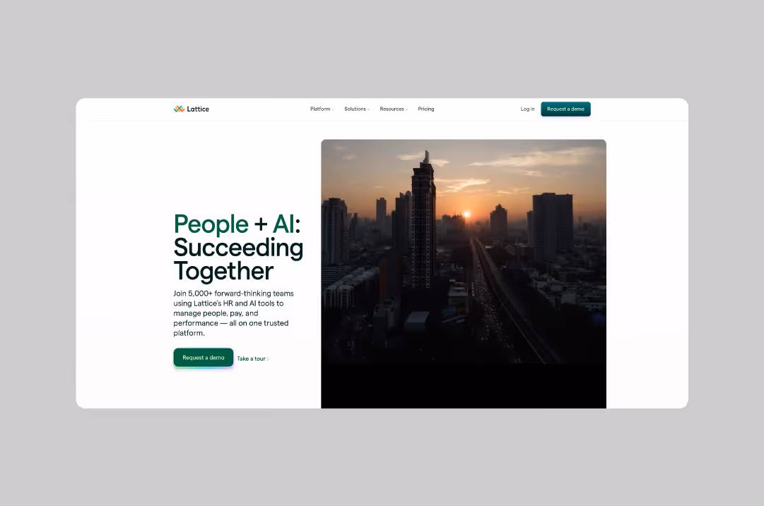
Lattice
Lattice understands that HR buyers need to see social proof, so customer logos and testimonials feature prominently. Their product screenshots show real functionality, not mockups. The entire site feels built for conversion with clear CTAs throughout.
Website: lattice.com
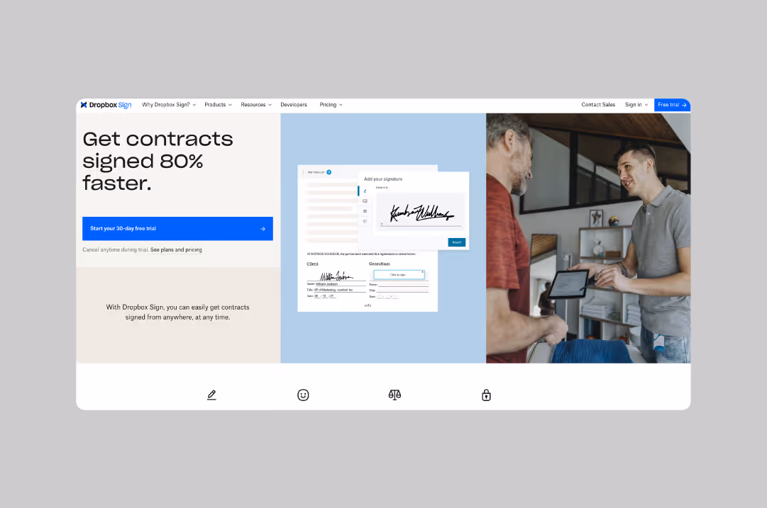
Dropbox Sign
Dropbox Sign makes digital signing feel simple and secure. The clear explanations of features paired with crisp product shots convey the easy and intuitive feel of their solution. Their homepage flow guides visitors from use case to pricing without friction. Smart integration demonstrations show exactly how the product fits into existing workflows.
Website: sign.dropbox.com
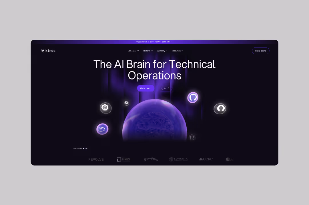
Kindo
Kindo's design reflects their product's sophistication without intimidating potential users. The contrast between dark and light website elements creates visual interest while maintaining professionalism. The overall effect is a feeling that their solution is cutting-edge and accessible.
Website: kindo.ai
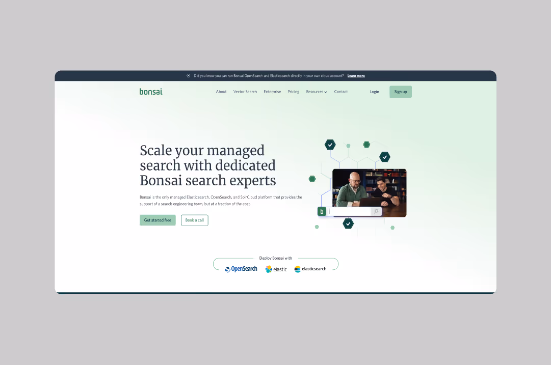
Bonsai
This website features simple design that doesn't compete with complex product functionality. Bonsai lets their powerful search capabilities speak for themselves through clear product demonstrations and straightforward messaging. Their Elasticsearch platform feels approachable despite technical depth.
Website: bonsai.io
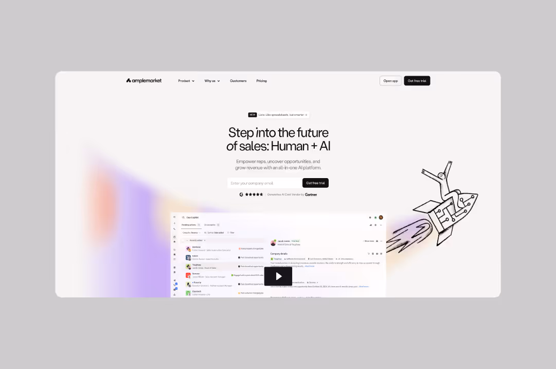
Amplemarket
Fresh visuals and a pastel palette differentiate the Amplemarket website from typical sales software. Their design feels modern and approachable while still communicating enterprise-grade capabilities. Smart use of animations demonstrates their AI sales automation in action.
Website: amplemarket.com
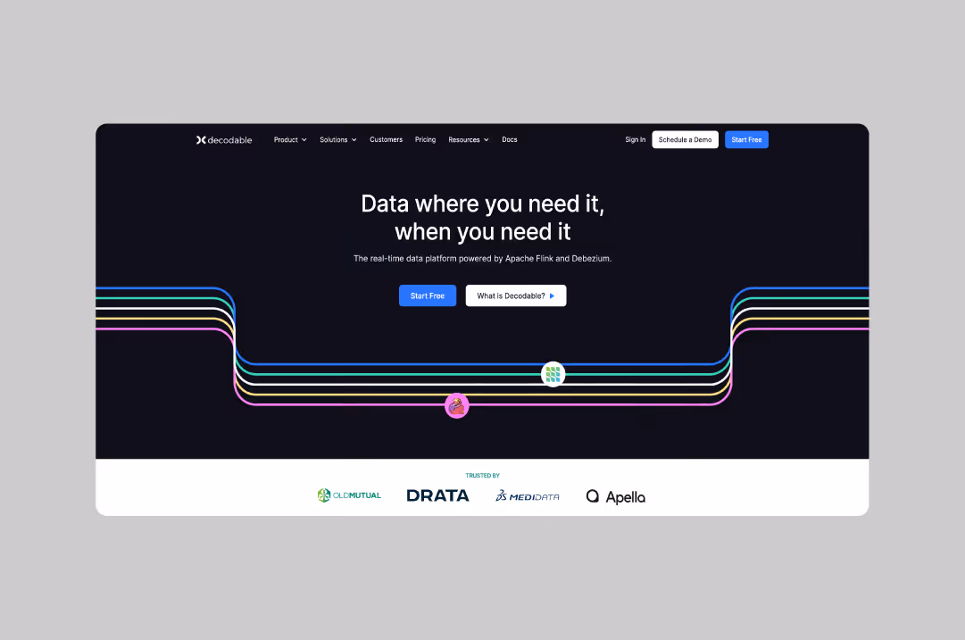
Decodable
Decodable strikes the perfect balance between technical depth and visual appeal, attracting both technical and business stakeholders. Playful colors and graphics make their developer tools feel accessible. They excel at translating complex concepts into digestible visuals.
Website: decodable.co
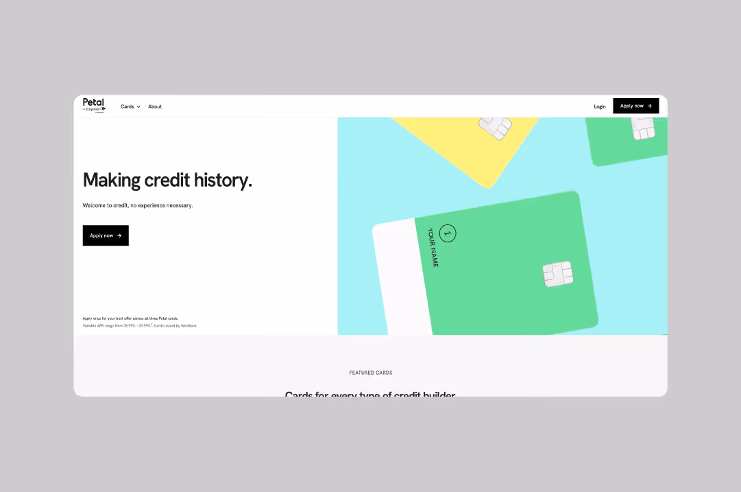
Petal
Petal's clean aesthetic communicates security and reliability, crucial factors for fintech buyers. Minimalist design with standout product visuals builds trust in their financial services. Their platform feels modern without compromising on authority.
Website: petalcard.com
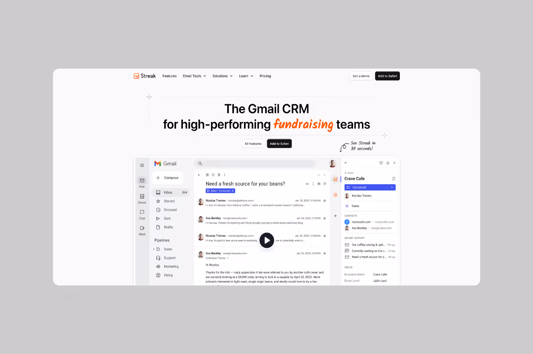
Streak
Streak shows exactly how their CRM integrates with Gmail, removing any guesswork for potential customers. Detailed product screenshots are interspersed with testimonials throughout the entire site to demonstrate why users rate it a robust and powerful tool.. Clear value propositions drive toward trial signups.
Website: streak.com
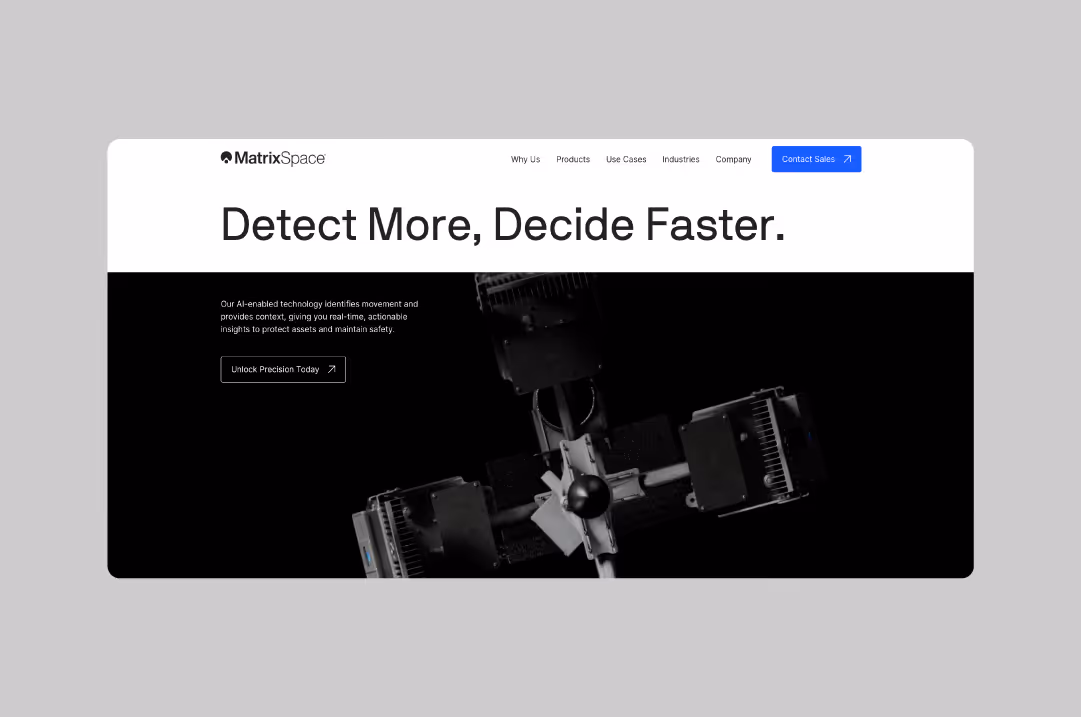
MatrixSpace
MatrixSpace uses visual proof to demonstrate their technology's precision and reliability. Stunning product shots that showcase AI capabilities demonstrate a variety of use cases. Their advanced object classification software feels cutting-edge through smart design choices.
Website: matrixspace.io
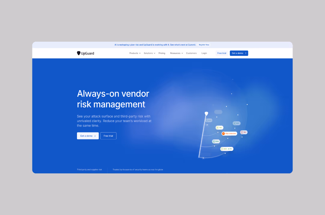
UpGuard
Trust-driven messaging and supporting visuals throughout every page create a narrative that gently coaches users towards conversion. UpGuard understands that security buyers need constant reassurance, so they weave credibility indicators into every section. Their cybersecurity platform feels authoritative and reliable.
Website: upguard.com

Raygun
Raygun's design balances technical depth with visual engagement, keeping developers interested while they evaluate features. Their app monitoring tool feels powerful and developer-friendly.
Website: raygun.com
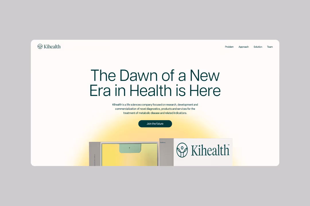
Ki Health
Minimalist design with a simple color palette reflects their focused mission to advance treatment for metabolic disease. Ki Health avoids medical jargon in favor of clear, human-centered messaging that resonates with healthcare professionals. Their diabetes testing platform feels approachable and trustworthy.
Website: ki-health.com
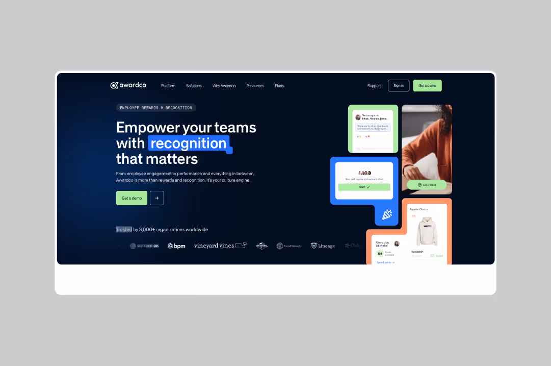
Awardco
Awardco leads with data that HR leaders care about, then supports those claims with customer success stories and product demonstrations. Their website features metrics-driven storytelling that proves ROI. Their employee recognition platform feels results-oriented and easy to use.
Website: awardco.com
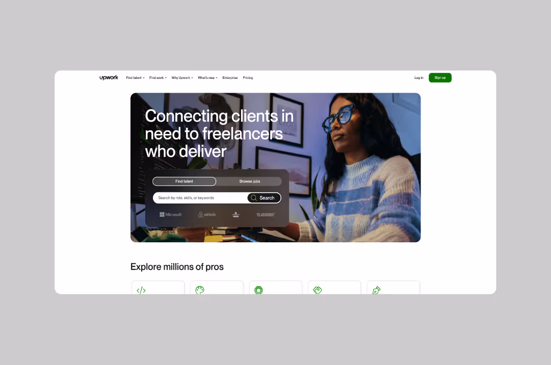
Upwork
Clean design and an intuitive layout make complex marketplace functionality feel simple. Upwork's homepage efficiently serves both freelancers and businesses without confusion. Smart segmentation guides different user types to relevant experiences.
Website: upwork.com
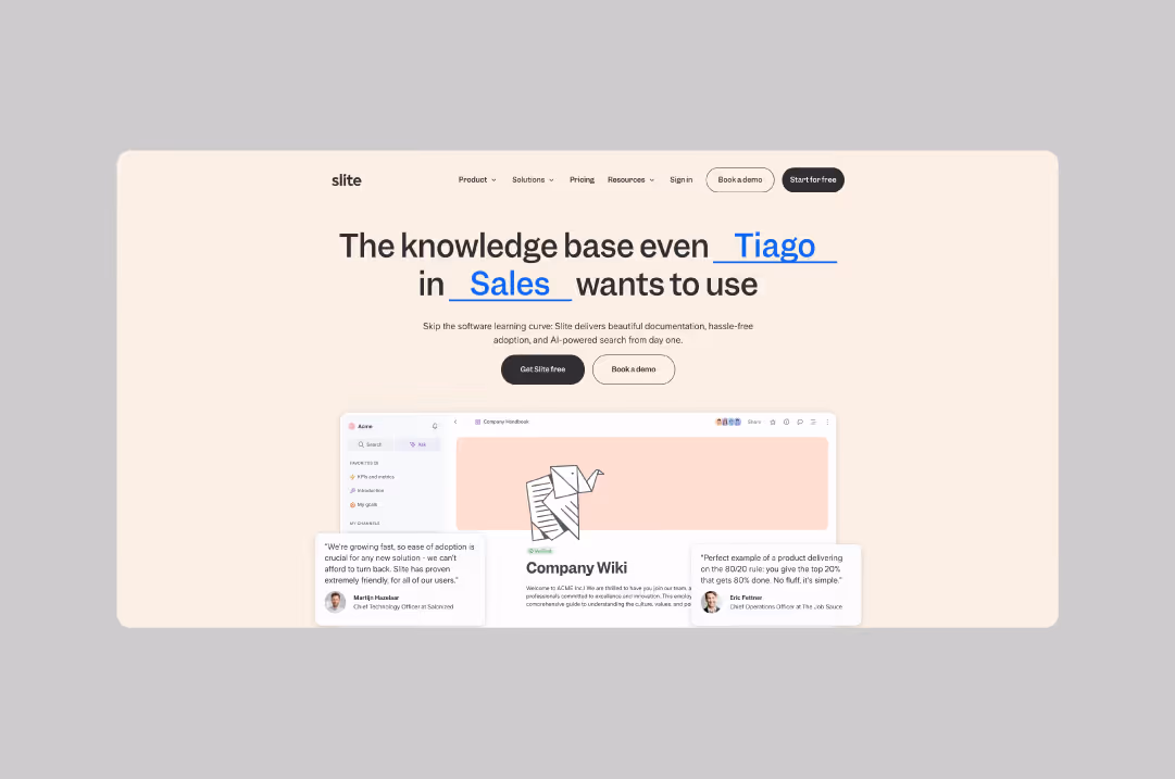
Slite
Slite's interactive elements showcase their platform's intelligence and ease of use. Scroll-stopping animations demonstrate product capabilities without overwhelming users. Their AI-powered collaborative workspace feels engaging and functional.
Website: slite.com
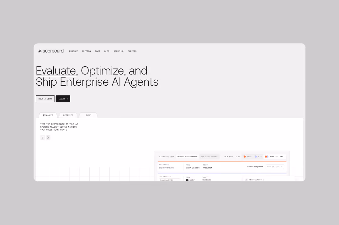
Scorecard
Scorecard makes enterprise AI evaluation feel approachable for technical and business stakeholders alike. The clear blueprint-style layout, combined with purposeful animations, works to explain complex AI testing concepts. Their testing platform feels sophisticated yet accessible and fun.
Website: scorecard.io
What These Sites Get Right
This selection of B2B websites showcases a broad variety of companies. Yet there is something they all have in common when it comes to their web design: they lead with clarity through messaging and visuals that show rather than tell to attract potential clients. They stand out because they are strategic with every design decision.
- Design flexibility meets enterprise functionality. These sites prove that you don't need a clunky enterprise CMS to create professional, scalable websites. Webflow's flexibility allows for custom functionality while maintaining the design freedom that sets great sites apart.
- Visual storytelling wins. The sites use design to simplify complex concepts. Whether through product screenshots, interactive demos, or strategic use of white space, visual elements do the heavy lifting.
- Conversion optimization is built in. Every element serves a purpose. From strategic CTAs to trust signals, these companies understand that beautiful design means nothing without results.
- Brand personality shines through. These companies find ways to inject personality into their websites without compromising on professionalism. They prove that B2B doesn't have to mean boring.
Why Webflow Works for B2B Companies
Traditional enterprise content management systems force an impossible choice: design flexibility or enterprise functionality. Webflow breaks the mold with a platform that allows for both, integrating seamlessly with various data sources.
- Design freedom without developer dependency. Marketing teams can make updates without waiting for engineering resources. This agility is crucial for fast-moving B2B companies that need to test messaging, launch features, or respond to market changes.
- Built-in performance and SEO optimization. Clean code and fast loading times help B2B sites rank higher in search results. When buyers search for solutions, you want to be found. Webflow's technical foundation gives you an advantage over sites built on bloated platforms.
- Scalable hosting and security. Built-in SSL, automatic backups, and robust infrastructure mean your site stays secure and online even when traffic spikes. Integration capabilities let you connect your existing marketing stack seamlessly.
Keys for Great B2B Website Design
Feel free to play with the possibilities for your website without neglecting to adhere to classic B2B principles. The strongest B2B sites guide visitors through a logical progression: problem recognition, solution exploration, proof evaluation, and action. Here's what to prioritize for B2B web design that is effective and on brand:
- Keep your buyer’s journey in mind: Does the design support your sales cycles, user types, and platform needs?
- Conversion optimization: Are CTAs clear and strategically placed throughout key points in the user journey?
- Process transparency: Is the navigation intuitive? Does the content flow logically as a part of an overarching brand narrative?
- Strategic thinking: Does the design go beyond aesthetics to support business goals?
- Brand identity alignment: Does the visual identity reflect your company's personality and values?
Building Your Own Standout B2B Website
Ready to join the ranks of companies creating exceptional B2B websites? Here's what you need to focus on:
- Start with strategy, not design. Before you touch a single pixel, understand your audience's pain points and decision-making process. Your website should guide visitors through their buyer's journey.
- Invest in professional design. Your website represents your entire company. DIY templates and stock photos signal that you cut corners. Enterprise buyers notice, and they care.
- Plan for performance and ongoing optimization. Fast sites convert better. Test different approaches, measure what works, and continuously improve based on real user behavior.
These 21 companies prove that B2B doesn't have to be boring, and Webflow can handle enterprise needs. They've created websites that not only look exceptional but also drive real business results.
The common thread? They understand that their website is a critical business asset, not just a digital brochure. Every design decision serves their broader business goals.
At BRIGHTSCOUT, we design and build conversion-focused Webflow sites for forward-thinking B2B teams. We've helped companies across emerging tech industries create websites that generate qualified leads and close bigger deals.
If you’re ready to level up, let’s talk.
FAQ
Why do many B2B companies choose Webflow for their websites?
Webflow gives marketing teams control without removing engineering oversight. Content updates don't require a sprint cycle, yet the front end can remain structured and performant. For B2B companies that depend on speed, that balance matters. Teams can test messaging, launch campaigns, and refine pages without creating operational bottlenecks.
What makes a B2B Webflow site stand out?
Strong sites start with positioning, not animation. Clear hierarchy, confident messaging, and disciplined layout do more than visual effects ever will. The best examples use Webflow as a system. Components are defined, patterns repeat intentionally, and the brand shows up consistently. The result feels deliberate rather than decorative.
Is Webflow suitable for enterprise-level B2B companies?
It can be, if the scope is well defined. For marketing sites and content-driven experiences, Webflow supports scale and performance when implemented correctly. Complex product applications or heavy backend requirements may require a different architecture. The decision should match business needs.
.jpg)


.png)
