The most visually impressive SaaS websites often are the ones that win deals are the ones that answer the right questions, in the right order, before a buyer ever gets on a call.
Great SaaS website design usually comes down to a pipeline problem, and the companies that understand that build sites that look sharp and sell hard.
Great SaaS website design is the strategic combination of visual identity, messaging architecture, and conversion design that moves enterprise buyers from first visit to qualified conversation. The best SaaS sites communicate why it matters to a specific buyer, reduce perceived risk before sales engagement, and make the next action obvious at every stage of the buying journey. Visual quality is necessary, and buyer clarity is what converts.
Why most SaaS websites look great but convert poorly
The SaaS website design process at most companies is optimized for the wrong outcome: to impress the founding team, win a design award, or pass a stakeholder review, not to shorten the sales cycle.
The result is sites that lead with product complexity instead of buyer context, that bury proof points behind beautiful animations, and that treat every visitor as if they're ready to buy when most are still trying to understand the category.
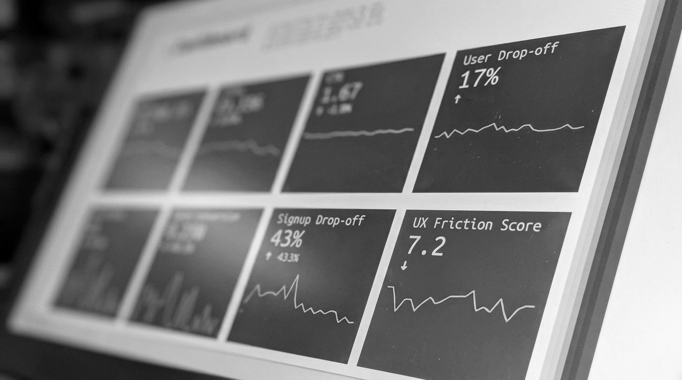
Gartner's research on the B2B buying journey shows that buyers spend only 17% of their total purchase time with vendors. That means your website is doing the selling in 83% of the buying cycle. A site that's designed for impressiveness instead of clarity is losing deals you never knew you were in.
The principles that separate great SaaS website design from expensive decoration
The SaaS sites that drive pipeline share a set of structural characteristics that have nothing to do with how they look and everything to do with how they're organized.
Positioning clarity before visual sophistication. A buyer who lands on your homepage should know who you serve, what problem you solve, and why you're different within five seconds without scrolling. Generic SaaS positioning like "The platform for modern teams" fails this test, while specific positioning like "Contract intelligence for enterprise legal teams" passes it. Additionally, visual sophistication amplifies a clear message.
Proof at every stage of skepticism. Enterprise buyers are professionally skeptical. They've been burned by software that over-promised. Great SaaS website design builds proof into the flow through specific outcomes, named clients, and metrics with context, not as a separate social proof section but embedded throughout the buyer journey. A testimonial that says "Reduced our contract review time by 60%" converts, but that says "Game-changer for our team" doesn't.
Navigation built for buyer intent, not internal org charts. Most SaaS navigation is organized around how the company thinks about itself by product: by department, by feature. Great SaaS navigation is organized around how buyers make decisions: by use case, by role, by problem. If your navigation requires a buyer to understand your product taxonomy before finding what's relevant to them, you're losing people at the moment of interest.
Performance as a trust signal. Forrester's 2025 predictions confirm that more than half of large B2B transactions will be processed through digital self-serve channels. A slow, broken, or mobile-unfriendly website comes down to a credibility signal, and enterprise buyers notice.
What great SaaS website design actually looks like across the buyer journey
The buying journey for enterprise SaaS typically has three distinct phases and a great website serves each one differently.
Awareness phase. Buyers here are researching the category, not evaluating vendors. Great website design at this stage offers educational content that demonstrates expertise without requiring a demo request. The goal is to earn trust and plant a flag in the buyer's mind before the competitive evaluation begins.
Consideration phase. Buyers here are evaluating alternatives. Great website design at this stage provides the specific proof they need, case studies that match their industry and company size, technical documentation that answers security and integration questions, and pricing signals that help them qualify fit without a sales call.
Decision phase. Buyers here have a shortlist and are looking for reasons to eliminate. Great website design at this stage removes final friction: clear ROI framing, implementation timelines, customer success evidence, and a demo request process that doesn't feel like a commitment. If you need a website audit to understand where your site is losing buyers at each phase, that's the fastest way to find the highest-impact fixes.
The technical foundations of great SaaS website design
Visual and structural design decisions don't exist in isolation from technical ones. Great SaaS website design requires a technical foundation that supports the experience.
Page speed affects conversion directly. A one-second delay in load time reduces conversions measurably. A CMS architecture that lets marketing update content without engineering support means the site stays current as the product evolves. A component-based design system means the brand stays consistent as the site grows. And UX research grounded in real buyer behavior means every design decision is validated against how buyers actually navigate, not how the team assumes they do.
Ready to build a SaaS website that actually drives pipeline?
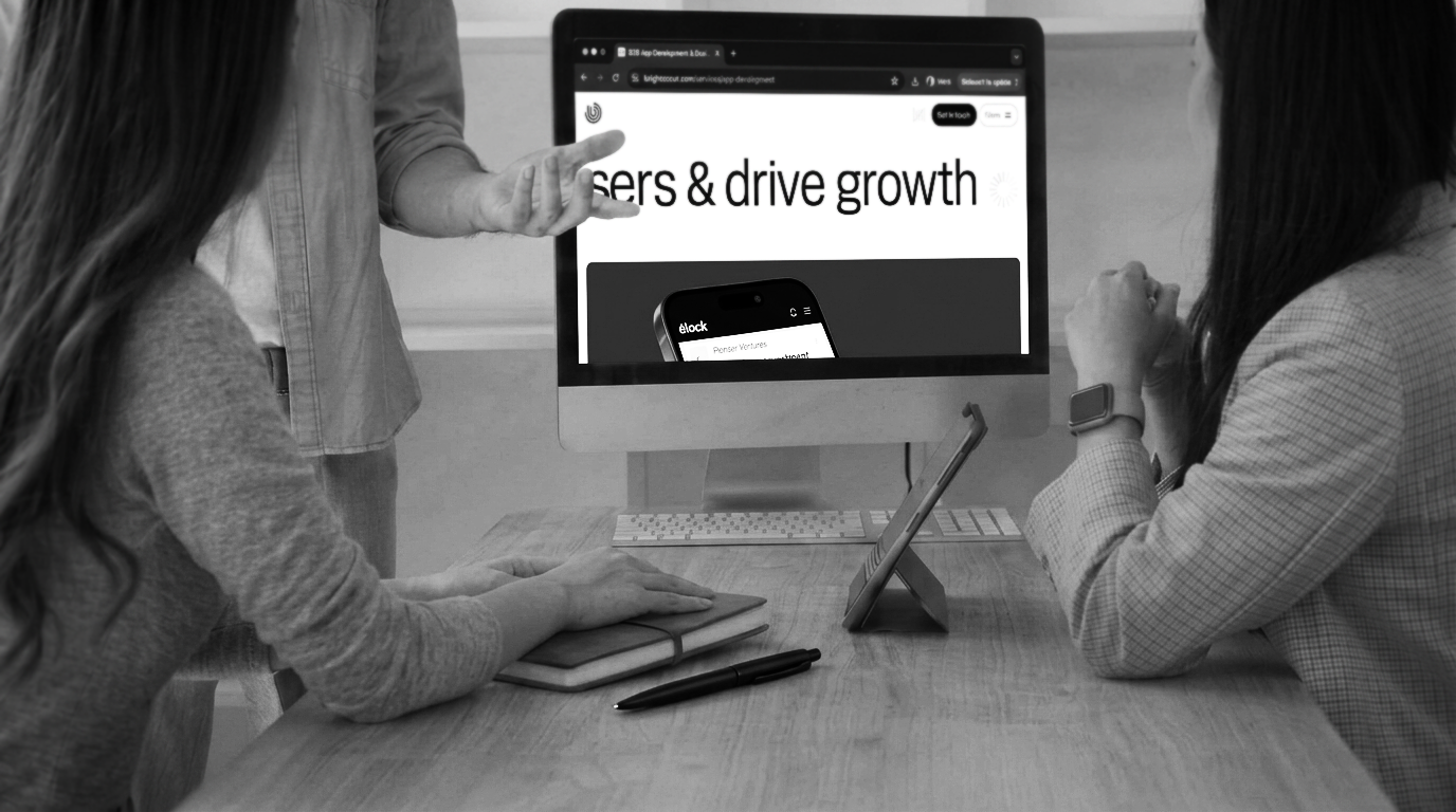
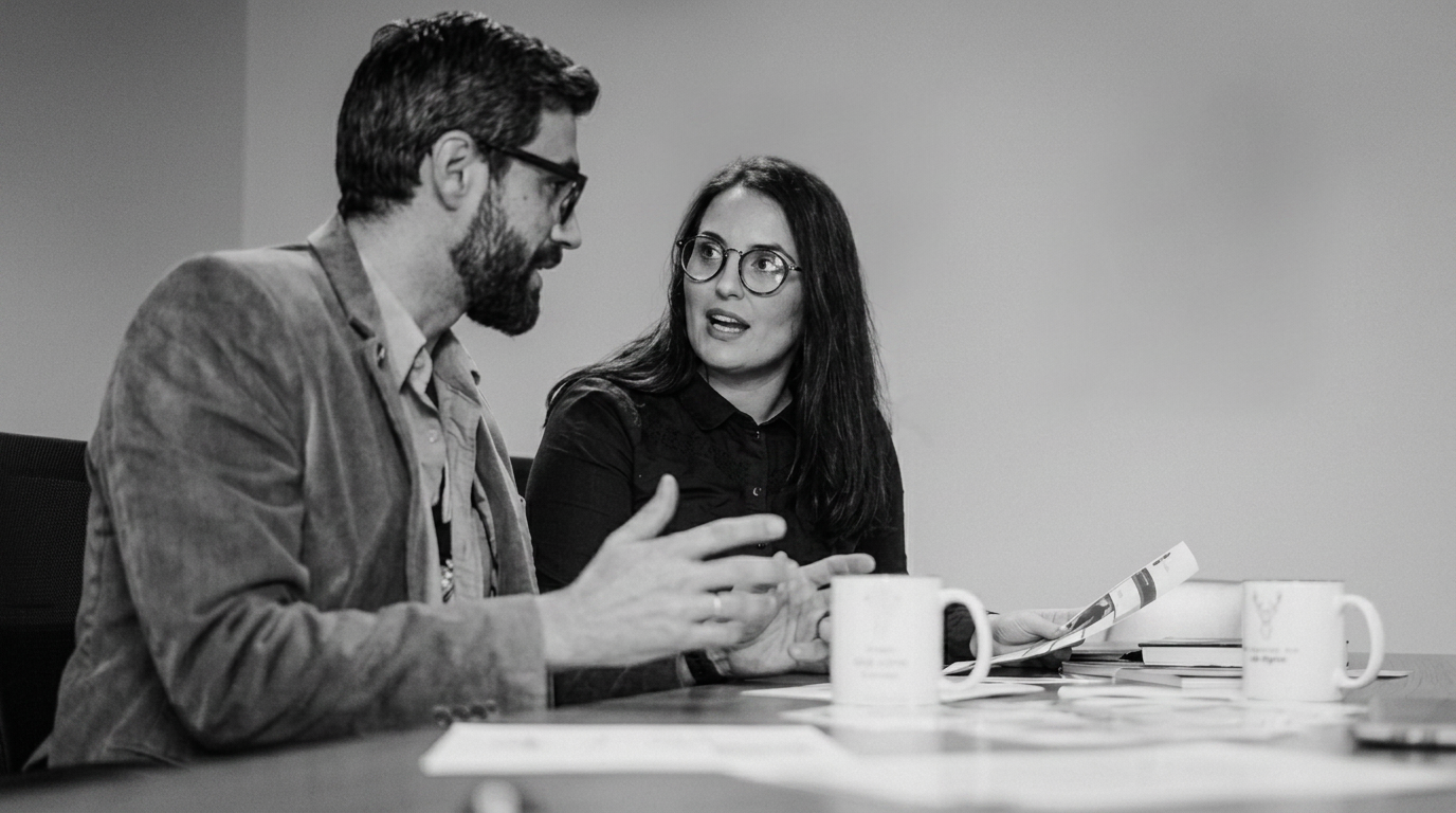
At BRIGHTSCOUT, we design and build SaaS websites for B2B tech companies with integrated design and engineering, no handoff friction, built to convert the buyers you're actually trying to reach.
Let's talk about what your site needs to perform.
FAQs
What makes a great SaaS website design?
A great SaaS website clearly communicates positioning and buyer value in the first five seconds, builds proof into the buyer journey rather than siloing it on a testimonials page, navigates buyers by use case and role rather than internal product taxonomy, and performs reliably across devices. The measure of great SaaS website design is pipeline impact, not visual impressiveness.
What's the difference between SaaS website design and regular web design?
SaaS website design must serve a multi-touch, multi-stakeholder buying journey that can last months. It needs to answer different questions for a technical evaluator, a business champion, and an economic buyer, all of whom may visit the same site independently. Regular web design optimizes for a single visit and a single audience. SaaS website design optimizes for trust that compounds across repeated visits and multiple decision-makers.
How long does it take to design a SaaS website?
A focused SaaS website redesign typically takes 8 to 14 weeks from strategy to launch, depending on scope and content readiness. The most common delays are late content delivery and undefined stakeholder approval processes. Teams that start with a clear messaging architecture and defined conversion goals ship faster and see better results.
How do I know if my SaaS website design is underperforming?
Key signals: high bounce rates on your homepage or pricing page, low demo request conversion rates relative to traffic, sales team reporting that prospects arrive uninformed about what you do, and deals stalling in the consideration phase without clear objections. These are symptoms of a website that isn't answering buyer questions at the right stage of the journey.
Should a SaaS website be built on Webflow?
Webflow is the right choice for most B2B SaaS marketing sites because it combines design flexibility with marketing-team editability, has strong performance characteristics, and integrates well with CRM and analytics tools. It's especially effective when paired with a design system that ensures brand consistency as the site evolves.