

Most SaaS website design roundups are curated by visual impressiveness. The sites that get featured are the ones that look best in a screenshot with sophisticated animations, beautiful photography and inventive layouts. The problem is that visual impressiveness and conversion performance are different things, and in B2B SaaS, the second one is what matters.
The best SaaS website design examples for B2B tech companies are the ones where every major design decision can be explained by a specific buyer need at a specific stage of the research journey.
The best SaaS website design examples for B2B tech share a set of characteristics that have nothing to do with visual trends: clear positioning that communicates who the product is for within five seconds, proof points embedded throughout the buyer journey rather than isolated to a testimonials section, navigation designed around buyer questions rather than product features, and performance that doesn't degrade under real enterprise usage conditions. The visual quality is necessary, but the buyer clarity is what converts.
What separates great B2B SaaS website design from impressive B2B SaaS website design
The gap between visually impressive and commercially effective is where most B2B SaaS website design fails. Here are the specific characteristics that separate the two.
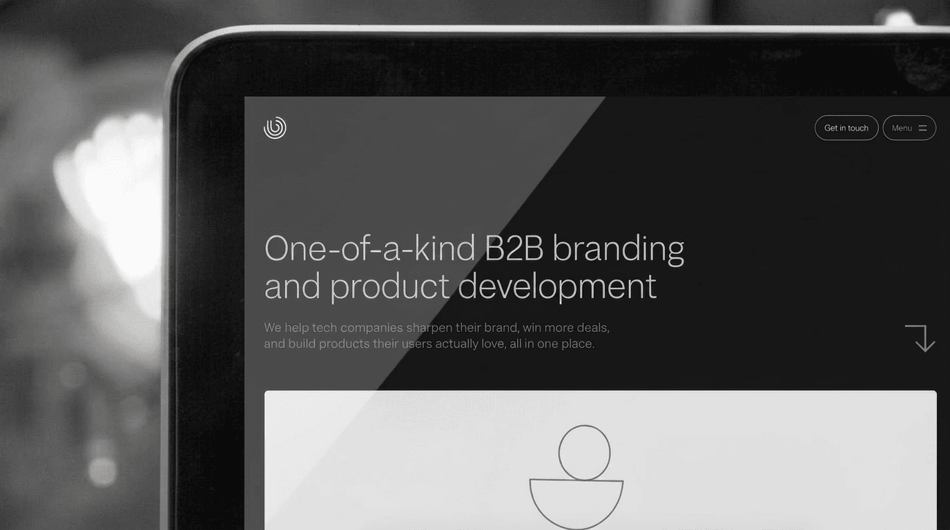
Positioning clarity in the first five seconds. The strongest B2B SaaS websites communicate who the product is for, what problem it solves, and why it's different before the first scroll. Not "the platform for modern teams,” which is a description of what no SaaS website should say. Specific, differentiated positioning that tells a specific buyer they're in the right place. The buyer who sees themselves in the headline and the subheadline will scroll, and the buyer who doesn't recognize themselves will leave.
Proof distributed throughout the buyer journey. Most SaaS websites isolate social proof in a dedicated section, usually a strip of logos and a testimonials carousel. The best-performing sites embed proof at every stage of the buyer journey: specific outcomes in the hero, case studies near product features, quantified ROI near pricing, and security certifications near the demo request. Proof answers the objection that's forming at each stage, not just the ones a buyer brings to a testimonials page.
Navigation designed for buyer questions, not product taxonomy. Enterprise buyers don't navigate by question: what can this do for my specific use case? How does it work with the tools I already have? What do companies like mine use it for? How much does it cost? Successful B2B SaaS website navigation makes those questions answerable without requiring a buyer to understand the product's internal organization.
Performance as a trust signal. Nielsen Norman Group's State of UX research consistently shows that enterprise buyers evaluate a vendor's operational quality through the quality of their digital experience. A slow, broken, or mobile-unfriendly site is a signal that the company behind it doesn't attend to details. Enterprise buyers notice.
The design patterns that appear in the highest-converting B2B SaaS websites
Gartner's research on the B2B buying journey shows buyers complete 80% of their research before engaging a vendor. The design patterns that appear most consistently in high-converting B2B SaaS sites are the ones that serve that 80% well.
The hero section as a positioning statement, not a product demo. The hero section does one job: tell the right buyer they're in the right place and give them a reason to keep reading. Product screenshots and feature lists in the hero serve the team that built the product, not the buyer who's still deciding whether this is worth their attention.
The "why us" answer before anyone asks. The best B2B SaaS sites answer the competitive differentiation question proactively, not in a page called "why us" but woven into every section. The feature that makes the company different from the incumbent should be visible within the first scroll. If a buyer has to go looking for what makes you different, they'll usually stop looking.
Demo request friction calibrated to the buyer. A demo request form with 12 fields converts fewer buyers than one with 4. But a form that's too easy to fill out generates unqualified leads that waste sales time. B2B SaaS companies who know their stuff calibrate their demo request friction to their sales team's capacity, which looks like enough qualification to filter for fit but not so much that qualified buyers bounce.
For more B2B SaaS website examples with analysis of what makes them perform, read our guide to the best B2B websites built on Webflow. And if your site isn't converting at the rate it should, a website audit is the fastest way to identify exactly where buyers are dropping off and why.
Ready to build a B2B SaaS website that converts?
At BRIGHTSCOUT, we design and build B2B SaaS websites where every design decision is grounded in how buyers actually make decisions, not how they look in screenshots.
Let's talk about what your site needs.
FAQs
What makes a great B2B SaaS website design?
A great B2B SaaS website communicates positioning clearly within five seconds, embeds proof throughout the buyer journey rather than isolating it in a testimonials section, navigates buyers by question and use case rather than product feature, and performs reliably on all devices and connection speeds. The measure of great B2B SaaS website design is conversion performance across the buyer journey, not visual impressiveness in a screenshot.
What are the most important elements of a SaaS website?
The hero section positioning, the navigation architecture, the proof distribution throughout the site, the product explanation clarity, the demo or trial request experience, and the site's technical performance are the most important elements. Each one serves a specific stage of the buyer's research journey. Sites that optimize all six consistently outperform sites that optimize only one or two.
How should a B2B SaaS company structure its website?
Structure the site around buyer questions rather than product features. The homepage should answer: what is this, who is it for, and why should I trust it. Product pages should answer: how does it work, what workflows does it support, and what do companies like mine use it for. Case studies should be filterable by industry and company size. Pricing should be visible enough to qualify fit without requiring a sales call.
How often should a B2B SaaS company redesign its website?
A full website redesign is warranted when the positioning has shifted significantly, when the information architecture no longer reflects the buyer journey, or when the conversion metrics have plateaued despite strong traffic. Iterative optimization like CRO testing, page-level updates and content refreshes should happen continuously. A major redesign every two to three years is appropriate for most growth-stage B2B SaaS companies.
What platform should a B2B SaaS company use for its website?
Webflow is the right choice for most B2B SaaS marketing sites because it combines design flexibility with marketing-team editability, strong performance characteristics, and clean integration with CRM and analytics tools. For content-heavy sites with complex editorial workflows or enterprise-scale requirements, headless architectures using Next.js or Astro with Sanity or Payload CMS provide additional flexibility at higher technical investment.
.jpg)


.png)
