

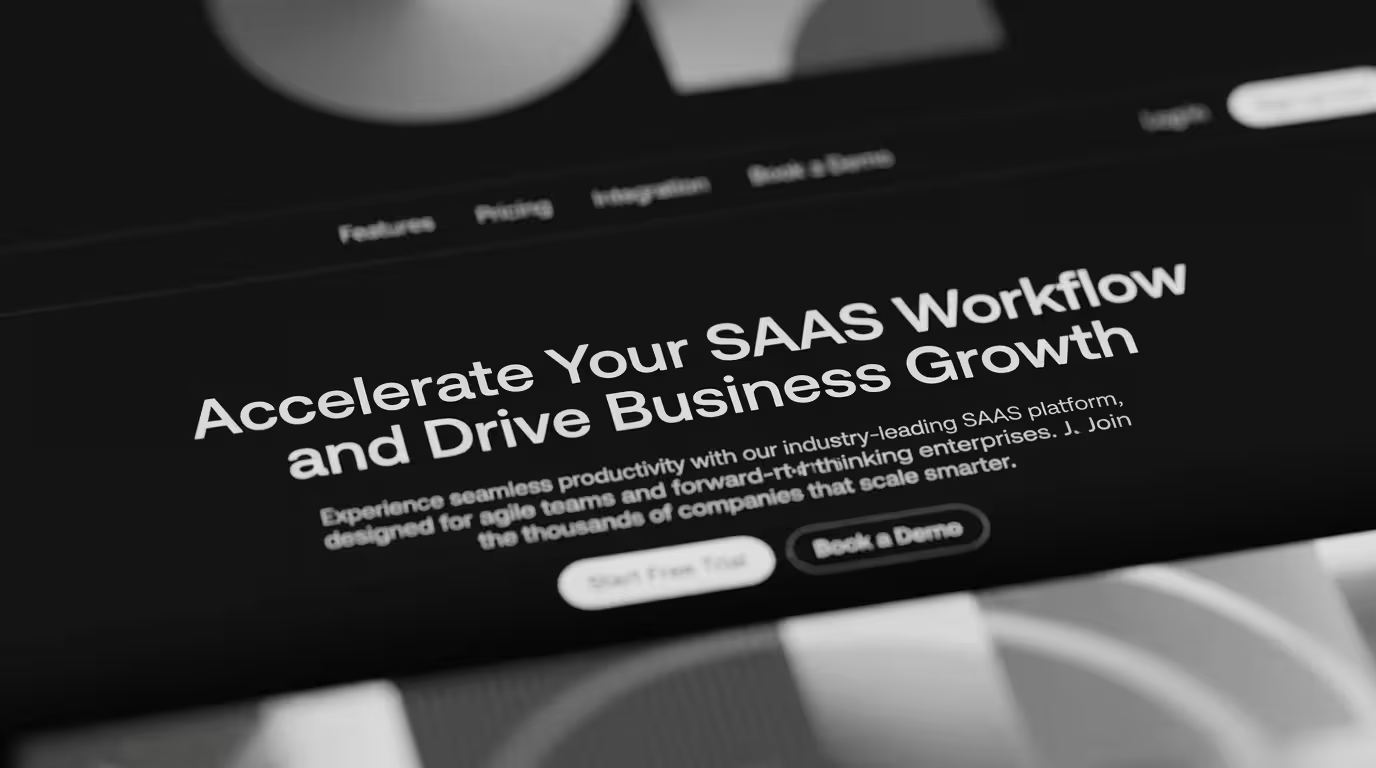
SaaS Landing Page Examples: What Makes Them Convert
SaaS landing page galleries are usually curated by looks. Featured pages are the ones that photograph well, with clean layouts, sophisticated type, and glossy product shots. The problem is that visual quality and conversion are two different things, and in B2B SaaS, conversion pays the bills.
The SaaS landing page examples actually worth studying are the ones where you can reverse-engineer every decision back to a specific buyer need at a specific stage of evaluation, and explain exactly why each element is on the page. That's the difference between inspiration and a template you can learn from.
The best SaaS landing pages for B2B convert because every section serves a specific buyer intent. The highest-converting B2B SaaS landing pages share a few traits: positioning that says who the product is for within about five seconds, proof matched to the exact buyer the page targets, one clear next step sized to buyer readiness, and performance that signals operational quality to skeptical enterprise buyers.
What the best SaaS landing pages have in common
Their headline answers the question "is this for me" before the first scroll. The pages that convert lead with a plain statement of who the product is for and what it does for them. A buyer who sees themselves in that line keeps reading, and the few seconds before the scroll decide whether anything else on the page gets a chance.
They match proof to the buyer the page is targeting. A page aimed at enterprise security teams should carry case studies from enterprise security teams, quotes from CISOs, and outcomes that mean something in that context. A Fortune 500 logo strip and an industry-agnostic testimonial don't reduce that specific buyer's specific risk. Buyers need evidence that mirrors their own situation before they'll feel confident moving forward, and generic proof doesn't do that work.
They offer one conversion path, calibrated to readiness. The best pages give a single clear next step. For a buyer ready to engage, that's a low-friction demo request. For a buyer who isn't there yet, it's a lighter option that keeps them in the research journey instead of losing them. Which one you lead with should follow from where the traffic source sits in the evaluation.
And they perform, because enterprise buyers read digital experience quality as a stand-in for how the vendor operates. A page that loads slowly or breaks on mobile says the opposite of whatever the copy is claiming. Core Web Vitals are a conversion variable.
The patterns in SaaS landing pages that don't convert
The same failures show up repeatedly. The most common is feature lists standing in for outcome statements: telling buyers what the product does instead of what they'll be able to accomplish, which leaves them to do the translation themselves. Close behind is proof that doesn't match the buyer, like a page aimed at mid-market companies stacked entirely with enterprise logos, which opens a credibility gap instead of closing one. Lastly, there's a CTA that asks for more than the buyer is ready to give: a "Request a demo" as the only option loses everyone still early in evaluation, which is usually most of the traffic.
For what high-performing B2B SaaS experiences look like at the whole-site level, our roundup of the best B2B websites built on Webflow shows the patterns that carry across a full site. And a website audit pinpoints where your current pages are losing buyers.
Ready to build SaaS landing pages that actually convert?
At BRIGHTSCOUT, we design and build B2B SaaS landing pages where every decision is grounded in what a specific buyer needs at a specific stage of evaluation.
FAQs
What makes a SaaS landing page example worth studying?
The ones worth studying are the pages where every decision can be explained by a specific buyer need. The point of studying examples is understanding the reasoning behind choices that actually produce conversion.
What do the best B2B SaaS landing pages have in common?
A headline that says who the product is for quickly, proof matched to the specific buyer the page targets, a single clear next step sized to buyer readiness, and technical performance that signals operational quality. Visual polish supports all of that, but it doesn't drive the conversion on its own.
How should a SaaS landing page be structured?
Lead with a hero that answers "is this for me" before the scroll. Follow with proof that reduces the main risk the target buyer carries, then a product or outcome section that shows what they'll be able to do, then social proof from companies they'd recognize, and finally a CTA that matches how ready they are to engage. The order serves the buyer's questions in sequence.
What is the most important part of a SaaS landing page?
The headline, specifically whether it says who the product is for and what it does for them within the first few seconds. Everything below is only seen by buyers who got past it. For most B2B SaaS pages, headline testing is the single highest-leverage thing you can do.
How do you create a SaaS landing page that converts B2B buyers?
Start from the buyer's intent: what specific question do they arrive with? Design every section to answer that and the objections that follow. Match the proof to the buyer type, offer a next step sized to their readiness, make sure the page performs technically, and then test.