Parq simplifies the creation and management of Environmental Product Declarations (EPDs) by automating data collection, AI-powered modeling, reporting, and third-party verification.
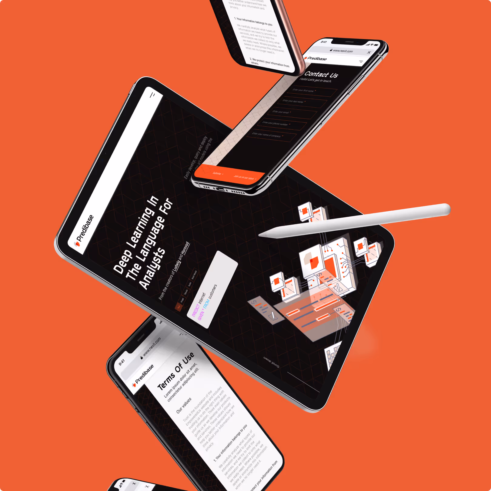
We worked on their product and app development and launch before helping them align their brand and website to their new market reality.


%2012.06.54%20p.m..avif)